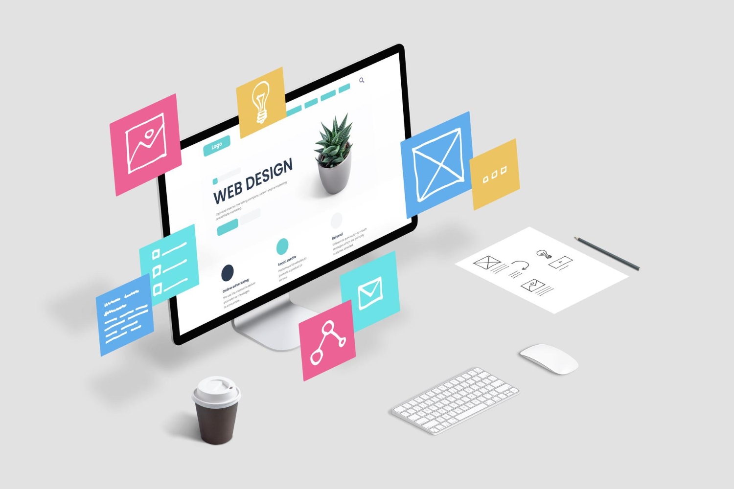
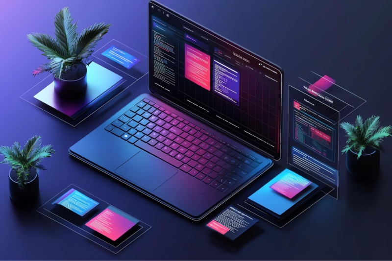
Learn how to design interfaces that work across different devices and screen sizes.This course focuses on creating inclusive experiences that are usable for all users.
Scott Lindberg | Level 1 Organization
Responsive design basics
Flexible grid systems
Inclusive design practices
Typography readability standards
Screen reader awareness
Mobile-first layouts
Accessibility principles
Color contrast rules
Keyboard navigation basics
Usability for everyone
Design today must work for everyone and on every device. This course focuses on creating responsive and accessible interfaces that adapt to different screen sizes and support diverse user needs.
You will learn how to design layouts that respond smoothly across devices, from mobile to desktop, while maintaining clarity and consistency. The course also introduces accessibility principles that help ensure interfaces are usable by people with different abilities, including visual, motor, and cognitive needs.
Through practical examples, you will explore how design choices such as layout, color, typography, and interaction affect usability and accessibility. The course emphasizes inclusive design thinking and helps you understand how small decisions can make a big difference for real users.
What You’ll Learn
By the end of the course, you will understand how to create digital interfaces that are both flexible and inclusive. You will be able to design products that work well across devices and provide a better experience for all users, not just some.
0 Reviews

Valentina Webb | Graphic Designer

Harris Robertson | Civil Engineer

Harris Robertson | Civil Engineer

Valentina Webb | Graphic Designer
Vivid Concepts | Fullstack Designer
Vivid Concepts | Fullstack Designer

Vivid Concepts | Fullstack Designer


 Number of classes
 Course Duration
Learning Model
Course Level
Course Duration
Learning Model
Course Level
 Number of Students
Student Enrolled
Number of Students
Student Enrolled
 Language
Send this course as a gift to your friends
 2 Video Lectures
2 Audio Lectures
2 Video Lectures
2 Audio Lectures
 5 Quizzes
 5 Assignments
 5 Downloadable Resources
 Full Lifetime Access
 Certificate not Included

Your experience on this website will be improved by allowing cookies.